Friday, 1 May 2015

Evaluation Question 7

Looking back at my preliminary task I would say that I have learnt a substantial amount, in many different areas. Whether that be how I approached this task or the actual design/look of my final product. I feel that my final coursework product was enhanced by my ability to play around with the software I used during the production of my magazine, software such as Photoshop, InDesign and dafont.com. Although I felt that my preliminary task was finished to a relatively high standard by the time I had completed my Full product I could see the improvement on my own skill level, for example I was able to add a diagonal strip onto my Front cover which I had neglected to do on my preliminary task as I didn't know how to do so.

I learnt other key lessons such as the importance of time management and how to spend time more effectively on coursework. When i started the AS brief I had an extremely laid back approach and took to long on my research and planning leaving myself a restricted amount of time for my actual product, which was worth the bulk of the marks. Although I was able to finish my product to a high standard I have learnt the importance of approaching my work with a sense of pride and determination, i can achieve this by setting myself goals to complete in a short amount of time.

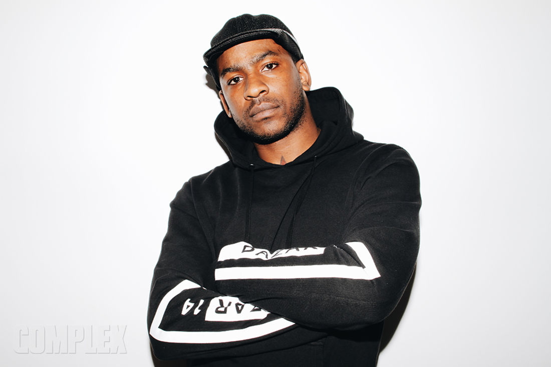
The front cover demonstrates the most noticeable improvement as i was able to use Photoshop to edit the brightness and general quality of the photo. The image I used on my Final Product proved to be much more challenging to edit as I decided to use a pre-existing background, unlike my preliminary which I used a white background for. I had to use a different set of skills in my coursework as I had to tackle the Contents and double page spread for the first time, my first draft of my contents was similar to my 'Talbot Times' Front cover, being extremely simplistic. I then had to redraft this as I felt it had the possibility to drag my mark down. 

In my preliminary task I had to extract the image from a much larger image, a problem I had to face during the production of my final product. My placement, design and creation of cover-lines improved as I was able to make sure they were all aligned properly as well as making sure that they looked sleek and were appropriate in regard to the genre of the magazine and the target audience. although the task itself was different the preliminary task helped me to understand the small changes I would need to make in order to target my audience correctly for example my genre meant that i could target the younger listener, for example teenagers or the older, more hardcore fans, early to late 20's.   


Evaluation Question 6

Through creating this product I have learnt about the wide range of tools that I can use on adobe software such as InDesign and Photoshop for example the ability to import different fonts off of the internet, from websites such as dafont.com, this aided me a great deal as I was able to import the font that I used for my mast head and my cover-lines. The ability to change/enhance a pictures quality, brightness and contrast helped me to achieve specific looks that helped with the connotation of my genre. Finally crop tools and eraser tools on these software’s have allowed me to add a unique effect to my images as well as the ability to merge 2 pictures together effectively.

Online tools such as popplet and blogger have allowed me to present my work to a higher standard whilst also helping me organise my work and answers to evaluation questions into sections and then subsections. Dafont.com has helped me to create a unique product as it has taught me about the ability to share and create different fonts online. Dafont was key for me as it allowed me to be far more picking when it came to selecting my fonts as I felt that the pre-installed fonts that come with such software as InDesign and Photoshop were to generic and weren't good enough for an As coursework piece. 

Photoshop and InDesign have taught me about the importance of alignment within a music magazine as my original draft had cover lines all over the page and looked messy and scruffy whereas when I redrafted and aligned them all it looked clearer and sleek, the ruler tool helped to achieve this look as a green line would appear on my page if the text/image/table was aligned with another on the page.

Whilst using Photoshop I learnt the importance of contrast and brightness when trying to manipulate an image. The Images I manipulated were the image of TYB, my featured artist, on a bench and the image of Queen-E on my contents page. The Queen-E image was relatively simple to do as I took the original image of her on a white background. all i had to do was find the background I wanted to use, crop my model out of her shot and place her onto this image. the difficulty lie in making this new image realistic, as i didn't want the fact i had just cropped and pasted her onto a background to be very obvious. the reason i decided to alter the original image was because I felt it needed to have more generic conventions, specifically the dirty and impoverish feel that many artists of the grime genre strive for.

The image of TYB was slightly more challenging to alter as i wanted to keep the floor, bench and model of the original shot but replace the background, as i felt that it didnt connote the grime genre strongly enough. I therefore had to find an appropriate image of a graffiti covered street that would match the parts of the image i wanted to save. The real challenge was adjusting the brightness of the different levels and making sure there was no apparent seam between the two images. I again used the Quick lasso tool and the sliders that control brightness, contrast, exposure and colour levels to create what i believe to be an all round appealing and believable shot.

Websites such as online mood board creators allowed me to add a different form of image to my blog which taught me about presentation even within my planning exercises as it helped to make my idea clearer not only to others but also to myself. Soundcloud again helped me to present my tasks in a different way which helped to show a wide range ICT skill.

The Camera I used was a Cannon EOS 700D. This process helped me hone my camera skills in as they were up until this point relatively basic. I learnt the importance of shot composition and the effect this can have on the way an audience interprets an media text. The composition of my shots was vitally important as my artist needed to have the rugged bad boy looks of a grime artist but also needed to look somewhat approachable and respectful of who he is and where he has come from. I feel that the shots I have taken help to portray this message.


Monday, 27 April 2015

Sunday, 26 April 2015

Evaluation Question 3

I feel like a company such as Bauer media would distribute my media product as they have a wide range of music magazines, with a wide range of different genres. Therefore I think that they would be interested in my product as it seems to plug a gap in the market. BARZ will have very few primary competitors as many other publishers don't see a magazine for the grime genre as a viable option. I feel that they underestimate the potential readership, as most young male in the UK are listeners of Grime, although it is mainly targeted at the younger audience it would gain following of older readers who are Hardcore fans of the genre.

The fact that i have used more than just music to target the audience helps to gain their attention as some may buy the magazine to see what cars are 'hot in 2015' and some may buy it to look at the fashion associated with the grime genre. Then there is the language I have used, readers will not feel intimidated by the language as it is not to complex, this again enable them to target a younger readership as well as a the lower demographic (C2DE) who may not be as well educated as readers of other magazines.

I think that there is a large potential readership as grime is no longer a regional genre with it gaining a large following from areas such as Manchester, Liverpool and Glasgow with artists such as Maverick Sabre and Bugzy Malone becoming prominent artists from these areas. Also Urban areas such as London and Manchester are beginning to bring the genre to the attention of the genre public by playing the genre on stations such as 1 Xtra or Heat F.M.

In conclusion I feel Bauer could make a large profit and gain a monopoly share in the grime scene genre if they distribute my magazine.

Friday, 24 April 2015

Evaluation Question 1

1.        In what ways does your media product use, develop or challenge forms and conventions of real media products?

Audience Feedback

Mr Woodward (27): 'although this isn't a genre I am familiar with I like the style of the magazine and the idea behind the audience that the magazine is targeting, although the contents page is slightly weaker than the rest of the magazine'

Tracy Walker (51): 'What is the genre? Sounds like it needs a good scrubbing. What is that boy wearing on his feet?'

Danat Tungushbayev (16): 'I like the layout of the magazine and the house style draws you in and makes you want to read more. You wouldn't even have noticed that the artist wasn't actually a rising star in the scene.'

Derek Edmond (59): 'The magazine is nice but I have no idea what most of the articles are or who they are about. What is a huarache and is it contagious? The layout of the magazine is nice although there is something else needed on the contents page. Also the language is fairly basic'

Emily Jerman (17): 'The music isn't one of my favorite genres but I don't mind listening to a bit of it occasionally, the magazine is very 'boyish' so i wouldn't say that I am part of the target audience but I can see why boys would want to read this magazine'

Clara Lane (26): ' the magazine is definitely not designed for me although I like the look of it. The genre is not one of my favorites at all!'

These answers have helped me to understand how to target my audience as they were taken after my first draft was complete, this helped me to tweak it so that it definitely targeted teenage boys. It helped that the older man found the language basic as this meant that it wouldn't be to complex for the targeted audience.

Final Product: BARZ


Thursday, 23 April 2015

Production Update 5

Today I created my first draft for my contents page although I have decided to change it, as i have decided that this will be the most likely to drop me marks. I felt that it was to basic and that in order to achieve the maximum amount of marks possible. I decided to keep certain aspects of the contents such as the main features column and the separate contents section

Production Update 4

I have begun to redesign my contents as I have decided to use a black background as my house style as i feel that it allows the contents to look stylish yet simple. I have decided to use the same font as the Masthead to again try to keep to the house style. My double page spread is written up and I have begun to place my articles around my Pull quote and placed my images around the page.

Friday, 17 April 2015

Production Update 3

Today I have begun to start placing the images on my contents page, finalizing my first draft of my Front cover, Writing up my Article and placing my cover lines on my front cover. I feel that there are to many blank spaces on my first draft off my cover, so i have decided to add a strip with a few small pictures, as I feel that it looks sleek and makes the cover more complete.
For my contents i have used the triangle method for 2 images and used normal images for 2 more. I have decided to place them on opposite sides of the page which I feel helps to make the page pop out to the reader.
The most difficult thing I did today was placing the cover lines as it is extremely tedious making sure they all line up properly, they are all the same size and make sure that they dont cross over an important part of the cover photo.

Thursday, 16 April 2015

Production Update 2

Today I took pictures for my Front Cover and double page spread. I have decided to go with having only one image on my front cover as I feel that my house style is going to be simple but easy to understand what genre I am going for. I have changed my Masthead font as i felt like the previous font didn't really suit the genre of music I had chosen. I have decided to go for a font I found on dafont.com called 'Capture it' as i feel that it looks better and also fits the genre of Grime much more effectively.
I also began to set up the template for my contents page, I have made one small change from my mock up which is getting rid of the row of images and placing them in different place around the page. like my mock up I am keeping one section for main features and another for general contents. I will also put the mast head of the magazine in the corner of the contents page. I will also take pictures of other 'artists' so that my contents page is not just full of images of my artist.

Sunday, 12 April 2015

Production update 1

This was the first lesson of production and although I do not have any photos to add to the magazine yet I played around with some fonts and created a basic template for my Front cover and contents page. I created a masthead using dafont.com, using a screenshot of the title of my magazine and editing it on Photoshop although I had difficulty with making the font chosen fit and suit the magazine and its genre.
I am trying to keep the layout of the magazine as close to my mock up as possible, although I have already decided it will not have a white background as I feel it will look to simplistic therefore I will try to use a more natural background to match the genre.

Monday, 16 March 2015

Target Audience


As you know grime is not considered a mainstream genre although in recent times has gain masses of fans due to song such as 'Shutdown' and 'Wicked Skengman 4 which have been released over the course of 2015. during the early days of the Genre Artists gained notoriety through the use of social media sites like BeBo and MySpace but now rely heavily on sites like SoundCloud, YouTube and Twitter.

I think that especially in the modern world it is vitally important that brands such as music magazines become multi platform as otherwise they run the risk of become irrelevant and outdated. sites such as YouTube and Twitter offer a fantastic opportunity for magazines to adapt by uploading recorded interviews, new songs and Vlogs.


The Audience I am targeting is becoming increasingly dependant on technology such as Iphones, Social Media and the Internet that it would be ridiculous not to use other platforms as well as written word in order to make a successful brand. Other Brands such as NME are now reliant on their online readership as the capital coming from magazine sales were so obsolete that they became a free magazine.  


Twitter is a great way for my magazine to promote itself as 95 to 99% of its target audience will have Twitter. Also with the site being so popular amongst the artists within the genre it can gain lots of attention if just one of the big named artists feature in an Article and retweet the Magazine. The readership also don't want to be bored with pages and pages of text so the 140 character limit allows my magazine to work out the best way to grab the attention of the potential readership with such limited characters. 


Sites such as Instagram have become very popular photo sharing social media outlets over the past few years and could be used by my Magazine to show the Artist they have featuring in their latest edition as well as videos of Artist 'shouting out', or bringing people attention to, my magazine. Again this is a very popular Social Media website within my potential readership demographic as they are young teenagers which is also who Instagram is targeting itself to.

Wednesday, 11 March 2015

Targeting an Audience

Age: 13 – 19 years old
I will try to keep the language quite basic so that the reader finds it an easy read as if the language is to complicated they will not enjoy the magazine and therefore will not want to read it.
·         Talk about things that will affect and interest them, there will be no point in talking about some of the deep and more meaningful parts of the genre such as unemployment and racial matters as this will not interest the reader whereas fast cars, branded clothing and humour will be things that will really interest the reader and make them want to read the magazine.
Gender: Predominately male
·         The genre of grime is a patriarchal genre of music (male dominated) which has made women feel very isolated from the genre therefore it would be safer to target the male audience with articles about cars, girls, games consoles, sports and branded clothing such as Fred Perry and Franklin and Marshall which are Brands that are heavily associated with the genre.
·        The fact that the lyrics are often hard hitting and very meaningful is again something that makes the genre a very male dominated music as when people think about music that is focussed primarily towards girls the language is much softer and airy, I will take this into account when writing my articles as I feel that if the articles are too light hearted then the male audience will be uninterested and bored by the article, equally due to the lower age of readers I will not make my article to hard hitting as I don’t want to have a negative effect on the reader.
·         I will try to focus on the more upbeat sub-genre of grime the ‘Party’ part of the genre as this is the most popular with this chosen age range but it’s the more positive, upbeat part.
Demographic: C2DE
·         The genre itself has already quite blatantly directed itself towards a very specific audience of ordinary or ‘common’ people. Therefore the audience demographic I will target is that of the lower class, this will be achieved through the use of basic or colloquial and unspecialised language, also by using images that they can associate with the genre for example images of graffiti, nice cars and the use of language that is used within them genre that is classed as slang, for example phrases such as ‘whip’.
Location: Urban Areas such as Dagenham, East London and BarkingsideThe areas in and around the east of London are where the biggest stars of the genre are from areas such as Dagenham, Hackney and The Manor are the birth place of stars such as Dizzee Rascal, Chip, Devlin and Lethal Bizzle. I will use this to my advantage by producing articles on these artists to attract the more casual listeners but with the focal point of the Magazine being up and coming and maybe less established artists for the Hardcore listener.

Monday, 2 March 2015

Mock Photoshoot


Image 1 - MS (front cover) 

For this image I used a medium shot(MS) as it allows the artist to demonstrate its character and also allows them to interact with their surroundings. I would probably use this image as a front cover shot as it has that sort of look whereas images that i would use in the article and contents page will more likely be of the artist in action. The reason I like this image is because it shows off the artists personality and that is the main purpose of this kind of article, it will give the readers an incite into who the artist is, what they stand for, their interests and the use of visual aids will be key especially when it comes to the age of the people the magazine is targeted at. I tried to keep the angle neutral, although I feel that the fact this image has a low angle to it which give the impression that the model/artist has an air of confidence which is exactly the sort of thing I am hoping to achieve for my cover picture. I feel the background shows that the artist isn't in a studio taking the perfect picture but is actually out in his local area therefore is someone who will be there to represent them instead of Turing their back on their upbringing and where the are from. The fact that the background is imperfect in a way is very symbolic of the genre as artists will often go off beat to demonstrate a point therefore i think that although it may be a very subtle implication many will subconsciously associate it with Grime as well as the area in which the genre, East London and areas such as Dagenham, which are often classed as grotty grimy and dirty.


Thursday, 26 February 2015

Artist Profile


Name: T.Y.B
Real name: Deniz Matur
Age: 23
Place of Birth: Canning Town


PERSONAL INFO

Influences: Skepta, Devlin, Stig of the dump, Wretch 32, JME
Social media:
Insta: TYBofficial
Vine: 6secondsofTYB
Snapchat: TYBsnaps
Favourite car: Ferrari F430 Italia
Current car: Fiat cinquecento
Favourite song: Chip - School of Grime
Dream artist to collaborate with: Royal Blood
Favorite Artist: To many!!


Interests: Basketball, Football, West Ham, Spitting bars and clubbing


Saturday, 21 February 2015

Artist Deconstruction - Skepta


Artist Profile
Name: Joseph Junior Adenuga (Skepta)
Age: 33 (19/9/82)
Place of Birth: Tottenham, North London
First Album: Greatest Hits (2007)
Biggest Hit: Shutdown (2015)
Latest Release: The Tim Westwood Mix (2015)

About

Skepta is considered one of the founding fathers of Grime music. Skepta, his brother JME and fellow Grime artist Wiley are part of the biggest most influential groups in the UK music scene BBK. They created their own record label and named it after their group, this has meant that they have never been signed by one of the major record labels. He has made songs with artists like Chip, Devlin and Young Lord and has introduced the UK music scene to some of it's rising stars such as Lady Leshurr and Krept and Konan.


I chose to deconstruct Skepta as an artist as I feel that he embodies many of the conventions and stereotypes that I wish for my own artist to possess. He has a stereotypical upbringing coming from a council estate in an area of London which is considered rough. He is unsigned which is a key part of the Grime genre as it is considered an underground genre which frowns on the mainstream artists and beats. he has an extremely confrontational man which has helped him to establish himself as a 'bad boy' in the music industry. The genre as a whole is considered aggressive with some of its biggest songs called things such as 'Feed'em to the Lions' and 'Soundboi Killa'.


Therefore my artist needs to be represented as aggressive and as having a chip on his shoulder. It is important that he is portrayed in this way in order for him to be seen as part of the genre. The clothing he wears is also extremely important as if he is wearing a shirt and some jeans he will not be stereotypical. If you take Skepta as an example he is often seen sporting a tracksuit and a baseball cap. Although I don't want my artist to be wearing this in his photo shoot I need to take this into consideration when I am picking an outfit for my character.

Saturday, 14 February 2015

Possible Fonts


Suggestion 1 - I like this font as it has an urban style which is conventional to the genre I am using. The font is caps lock which means it stands out and this is also a generic convention as many artists and music videos use caps lock for their  name or logo. I would definitely change the colour as black seems quite basic and wouldn't grab the attention of the reader. The style is similar to the idea I have in mind but i don't like the disjointed part of the A and I think that is is fairly basic. Although it is not strictly graffiti I could imagine it printed on a wall in London which is could as the idea of the poorer parts of London is one of the most prominent theme within the genre.


Suggestion 2 - I like this font as it has a graffiti look about it which is extremely conventional and is used in numerous grime music videos. One of the biggest setbacks is the fact that its is an extremely cliche font which means that it wouldn't be a fresh and original idea and instead would just be another conventional music magazine. One positive is that people would be able to tell what genre of music the magazine is representing, as the whole graffiti image has become synonymous with the grime scene and many of its artist. One of the most notable artists to use graffiti in many of his music videos is Kano who uses it also on his album covers and tour posters.

Image result for kano garage skank


Wednesday, 11 February 2015

Mock up (Cover Non-colour)


I have decide to go for a attention grabbing yet generic front cover as I feel that some of the conventions of a magazine  will appeal to my target audience for example:

  • Having a large image of a featured artist, so they know exactly who the major article in the magazine is.
  • Having my Masthead at the top of my magazine so that the audience is automatically drawn to the top the page, making it more likely for them to scan down the page. This will hopefully mean that they will see an article about an artist, clothing or a hobby that interests them meaning they may purchase the magazine.
I decided to place the cover line for the featured artist in the center of the page to make sure that it grabs the attention of the reader. i chose to centralize the image of the featured artist so that could place cover lines and sub text on either side, making sure that the text is not all bunched together and difficult to read.
My cover lines will only be 2 colors as i have decide the house style will be the use of the color white, from the Masthead, and another colour based on the featured artist of that issue.

Mock up (Contents)


I decided to keep the contents page quite simple, as I thought that if there was too much going on within the page it would be confusing and wouldn't be appealing. I made sure that the 'Contents' was the same font as the Masthead as it need to be obvious that it is part of the magazine and keeps to the house style I have chosen for the magazine which is an urban look which will include Graffiti and other things associated with the genre. I want to keep it obvious that the magazine is representing the grime scene so that it can immediately attract the appropriate audience. 

I have decided to try something different with the images, I will use Photoshop to create a unique and sleek look to the magazine. I will try to keep the images in the contents page of featured artists and key articles within the magazine for example, I have the idea of using my classmates to model as up and coming artists whom will have articles about them in the magazine.

Mood Board


Wednesday, 4 February 2015

Treatment

My idea for my music magazine is a 100% UK rap/Grime magazine as I feel that there is a gap in the market for this product within the UK. As i found out in my focus group interview Grime lacks the mainstream attention of other genres for example Pop and R&B, at first this could be a slight problem as people may not be willing to buy this magazine due to their lack of knowledge of the genre, but I feel that this magazine could help grime gather much more mainstream attention.

My idea is to exploit the more positive side of grime rather than focus on the often very negative songs that can be produced, I feel it will be easier to make a positive magazine than a negative one. The magazine will feature a range of up and coming artists and current and well established artists such as Wiley, Tinie Tempah, Devlin, Stig of the Dump, JME and Lethal Bizzle. I feel that the use of social media will be key to the success of the magazine as the younger generation (my target audience) use this much more frequently than other such media sources.

The USP of the magazine will have to be carefully considered so that youths are attracted to it, also due to the fact i will be aiming it at young men/boys i will also have to think about what stage of adolescence they are in and therefore what will entice them into buying a magazine, the use of things like 'top ten fittest' or 'top ten fastest' as i feel this articles such as these will make teenage boys want to read this magazine.


Heatwave Wiley (music video)


This style of grime is one that I think will be the one that my target audience will feel that they are most able to relate to as it is fairly lighthearted rather than heavy and deep like some other artists such as Devlin and Stig of the Dump. The summer time theme is one that I think will be a key area that I will use within my magazine as it will allow the audience to see the brighter side to where they live. The fact that the artist is driving a nice, flash car could be used to my advantage as I could use it as a way to try to motivate the younger C2DE generation to see what they could achieve if they are to work hard.

Rari Workout Lethal Bizzle (music video)


This music again shows the much lighter side of the grime genre and the scene in general. The use of flashy cars and designer and branded clothing. The fact that there is not much swearing in this song allows me to use these artists in my magazine as I am targeting the younger part of the audience as i feel that they will be most likely to read a magazine, also they will also more likely to aspire to be like the artists which I will be able to my advantage. The final point I have taken for this music video is the syle of clothing, which is tight tops, vests, snap-backs and man-bags which i will incorporate into my product.

Friday, 23 January 2015

Focus Group Interview


 This interview gave me a much greater incite into whether or not my idea for a music magazine was a viable one, there were some parts which as planned demonstrated that my original target market of the C2DE demographic was the right one, as the genre that is UK grime is not one that most of the people whom I interviewed were aware of. The fact that all of the people I had interviewed went to a private school in a way was a positive as I now have the choice of whether to aim my magazine at a young C2DE readership or to aABC1 readership which could broaden the audience of the genre. I think that it will be easier for me to target a younger C2DE readership as the genre is already established within the age group and demographic.